Monday, 16 May 2011
Audience Feedback
What we learned from Audience feedback main task:
Positive:
- They thought the cinematography was effective, and professional
- They said the settings were effective in conveying the idea that these were middle, class bourgeoisie characters, such as the lavish houses in the background and the sports we played such as golf and bowls. This was very pleasing as we were worried we wernt communicating this idea as well as we’d liked.
- They said it suited the style in that:
- Our Target Audience was clear and they felt it was appealing to a teenage audience, in the costume and the persona they were trying to achieve, as this is an idea a lot of teenagers have today.
- They also said that it suited Dizzee Rascal as an artist, as his songs are generally quite comedic and humourous, and humour is often used in his videos, seen in such videos as Dirtee Disco. This was again pleasing to hear as this was something we planned and it was good to see it came through.
Negative:
- The Lip Syncing – they said was sometimes out of time and generally in places a bit unclear. This was something we realised would be difficult as rap music involved talking at incredibly high speeds, so we did find it difficult to keep up with the fast pace as amateurs. If we were to do this again this is something we could build on.
What we learned from Audience feed back (ancillary Tasks)
Positive
- Suits Target Audience, bright vibrant colours make it stand out in a shop
- Suited typical conventions of an advertisement
- Information was useful on the advertisement
- Names on the digipak ‘theodore’ ‘cornelius’ were effective in conveying the message
Negative:
- Font colour choice of orange they questioned, they felt it was an odd choice on the advertisement and didn’t reflect the ‘gangster’ effect the boys were attempting to achieve
- Positioning of some of the shots, Kate felt that it looked slightly unprofessional in places due to a lack of symmetry in the advertisement with James out of shot slightly.
- More about Dizzee Rascal the artist in the digipak, it looked like we were the artist.
Sunday, 6 February 2011
How did you use new media technologies in research and planning, construction and evaluation stages? - Ned Keating

Above is a Panasonic Lumix camera, similar to the one we used in the construction of our digipacks and advertisement. We chose the use the Lumix camera given its high pixel level and its face recognition technology, which helped significantly with the intimidating advertising shot.

The above image is of an Apple iMac computer, which we used in all three stages of our coursework. For the research stage, it was used to look at videos on YouTube and gain information on the artist from various websites. For the construction phase, we edited our footage on these computers using the iMovie HD software. This software was also used to edit the audience feedback we received, and is how we used the computer in the evaluation stage of the coursework.

The final image is of the camera which we used for the coursework. The camera similar to the one above was used in both the construction and evaluation stage, as we used the camera to film the footage for our music video and our audience feedback, before uploading the footage on to the Apple iMac computers.
Tuesday, 1 February 2011
Lesson Monday 31st January
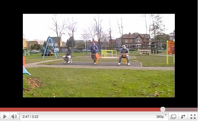
Our lesson objective on Monday was to start activity 2 which involved gaining audience feedback about our music video. Three people were asked to view the video a couple of time and give feedback and various points including: Cinematography,Editing , Mise en scene and Typical Music video Conventions. This feedback was recorded on camera and shows a great insight into what an audience thought about the music video
Sunday, 30 January 2011
Monday, 24 January 2011
Discuss how your advertisement uses typical conventions of a layout - Martin Woodhatch and Joe Jones
Below is an annotated version of our advert:

We researched a number of advertisements before eventually constructing our own. To do this we researched different types of advertisements such as Florence and the Machine's advertisement and also UK rap sensation Tinchy Stryder. After our research, we included the following conventions:
Comments from Newspapers and Magazines:

Details of the record release:

Clear display of the artist name and song title:


An image or picture that conveys the mood of the video:

We feel that you get a real sense of the mood of the video, the intimidating expressions and the low angle shot, suggests a threat and dominance, however, this is juxtaposed with the young, fresh faces that sport them.
Discuss how your digipak uses typical conventions of a layout - Ned Keating and James Wilson
Below is the annotations made on our digipak:


As one can see, this is the back cover for our digipak. On the back cover, you can see there are track listings, a barcode and copyright symbol. All of these are typical conventions that you would expect to find on the layout of the back cover of a digipak. We chose to follow these conventions because it is rare for a digipak to not include all three together on the back. There are also some examples of digipaks, such as the one below.

We wanted our back to the audience on the back cover to highlight the fact it is the back and we wanted to show the attitude the band has.

Above is the front cover of our digipak. This also follows the conventions of a typical layout of a digipak, as the name of the artist, the name of the track and an image of the artist appear on the front cover. We chose to include all three of these conventions on our front cover because they help people to identify the artist and record whilst glancing at the front cover on a shelf. Furthermore, the image on the front of the digipak is a striking one, with vibrant colours. This was constructed so that the boldness of the front cover would draw attention.

On the fold-out slide of our digipak, we included a group shot with the lyrics to "Fix Up, Look Sharp". Many digipaks have a lyric sheet located somewhere within, so we chose to include one so as to keep following the convetions. We also chose to include a group shot on the lyric sheet as, while it is not a typical convention, it shows the audience the dynamics of our group.


The three images above do not follow typical conventions of a music video, nor are they present in the digipaks we have researched. However, we chose to include them to further enhance the message that we are trying to convey - failing, middle-class "gansgters". This was achieved through the use of "gangster"-like poses.
Tuesday, 18 January 2011
In what ways does your media product use, develop or challenge forms and conventions of real media products? - Joe Jones

In our music video, we made use of lip syncing, a convention which is commonly seen in many music videos. We chose to include lip syncing in the music video as many of the videos we have previously analysed for the blog, "Burn, Burn" by Lostprophets and "It Wasn't Me" by Shaggy. We also included lip syncing as many "gangsters", who we attempted to imitate, enjoy rapping. Whilst the lip-syncing may have been better in some places, we think the overall quality of the lip-syncing is very good.

The style of the music video is intended to be comical. This is in contrast to many hip-hop and rap videos, which are often serious. Therefore, we subverted the conventions of hip-hop and rap videos. We chose to do this because, as a group, we thought our skill set would be better suited to a comical storyline. In the creation of the plot, we were heavily influenced by The Lonely Island, who take a light-hearted approach to their videos. Judging by the feedback we have received from fellow students, outside of our media class, it seems that the video has achieved its humourous purpose.

In terms of the costume, we followed conventions of stereotypical clothing worn by gangsters. As you can see from the vidcap, each member of the gang is wearing a 'hoodie', tracksuit bottoms and trainers as well as a golfing glove. The main gangster can also be seen wearing a bandana around his neck. We felt it was vital to dress like this to convey the idea that we are gangsters. However, we also decided to dress the main gangster in a pair of spectacles, so as to show that we are a failure at being gangsters. It appears, however, that the people who have so far seen our video, did not fully get the message of the parodying nature of the clothing. It could be said, then, that the clothing may have been a failure; we disagree with that view the viewers did still find the costumes funny, just not in the parodying way we hoped for.

Within the video, we made use of James' car. This was used as cars are often seen within a gangster and rap music videos. However, the cars are often big Range Rovers or stylish sports cars. This is a contrast to James' Toyota Yaris, which is pictured above. Again, this is an example of the gang trying to be full fledged gangsters but failing miserably. Again, with the costumes, the viewers found some of the props, like the candy sticks, humourous but just not in the parodying way. Therefore, this section did not work as well as we had hoped.

The locations used within the music video are also intended to be comical and subvert the general conventions of rap videos as they are not usually filmed in a suburban area. Instead, they are shot in inter-city locations. Owing to many people whose properties we wished to use in our video refusing to allow us to film there, many of the locations had to be changed from the original. Here, again, the message of middle-class "ganagsters", failed to get through to many of our viewers, but again we still think this worked well within our video from an artistic point of view/


The above three images all show different examples of the camerawork used within the music video, each of them displaying a different type of shot. We decided to use a variety of shots within the video to obviously prevent the video from becoming boring, as all the humour would have been lost if the same shot wa used constantly. Furthermore, some shots were used to create an effect, such as the close-up on the carton of Tropicana for the appropriate lyrics. As a group, we believe that the shots used in the video were of a good calibre and the attempt to use a variety of shots were successful.
Subscribe to:
Posts (Atom)